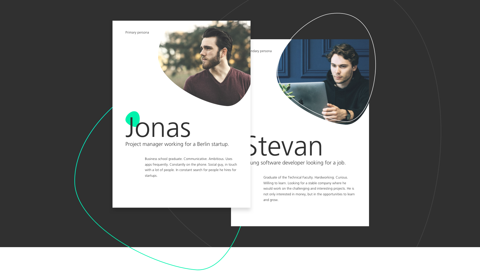
Who are we making this for?
Why are Jonas and Stevan important? Why not any other Sally or Petar?
Forming a clear picture of the targeted personas enabled us to anticipate their potential concerns and adapt the design accordingly.
Are we on the same wavelength?
The idea was to make a modern and vibrant website. How could we be sure to understand these concepts in the same way as our client?
We let the moodboard speaks. Aligning with the client upfront has saved a significant amount of time and resources for both parties.
We let the moodboard speaks. Aligning with the client upfront has saved a significant amount of time and resources for both parties.
Capturing the client's nature of business
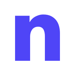
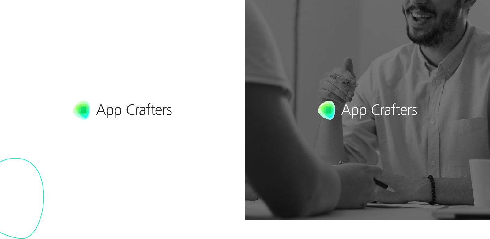
When designing the logo, we started from the core element - the iOS button for apps. The radiant surrounding shapes portray the interaction with users and the App Crafters' close relationship with clients. We've introduced the eye-catching green to highlight the overall dashing vibe of the company.
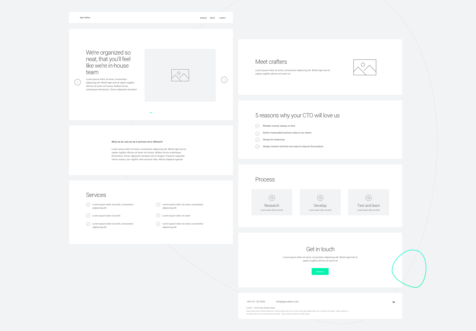
The perks of iterating quickly
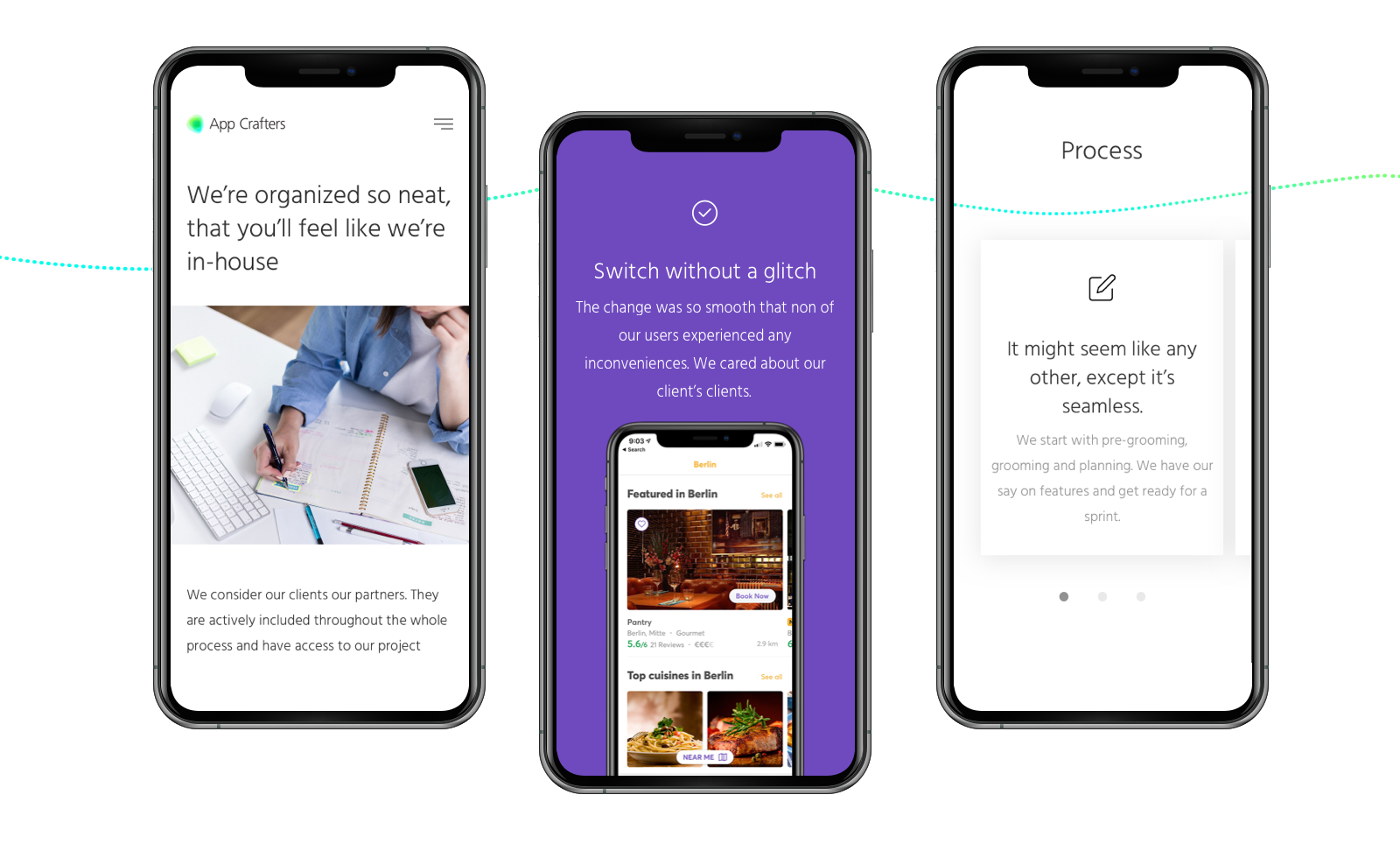
Creating wireframes allowed us to get as much valuable feedback as possible in the shortest amount of time. It was much more efficient for us to make changes to the wireframes, rather than at a later design stage.
Orchestrating the team
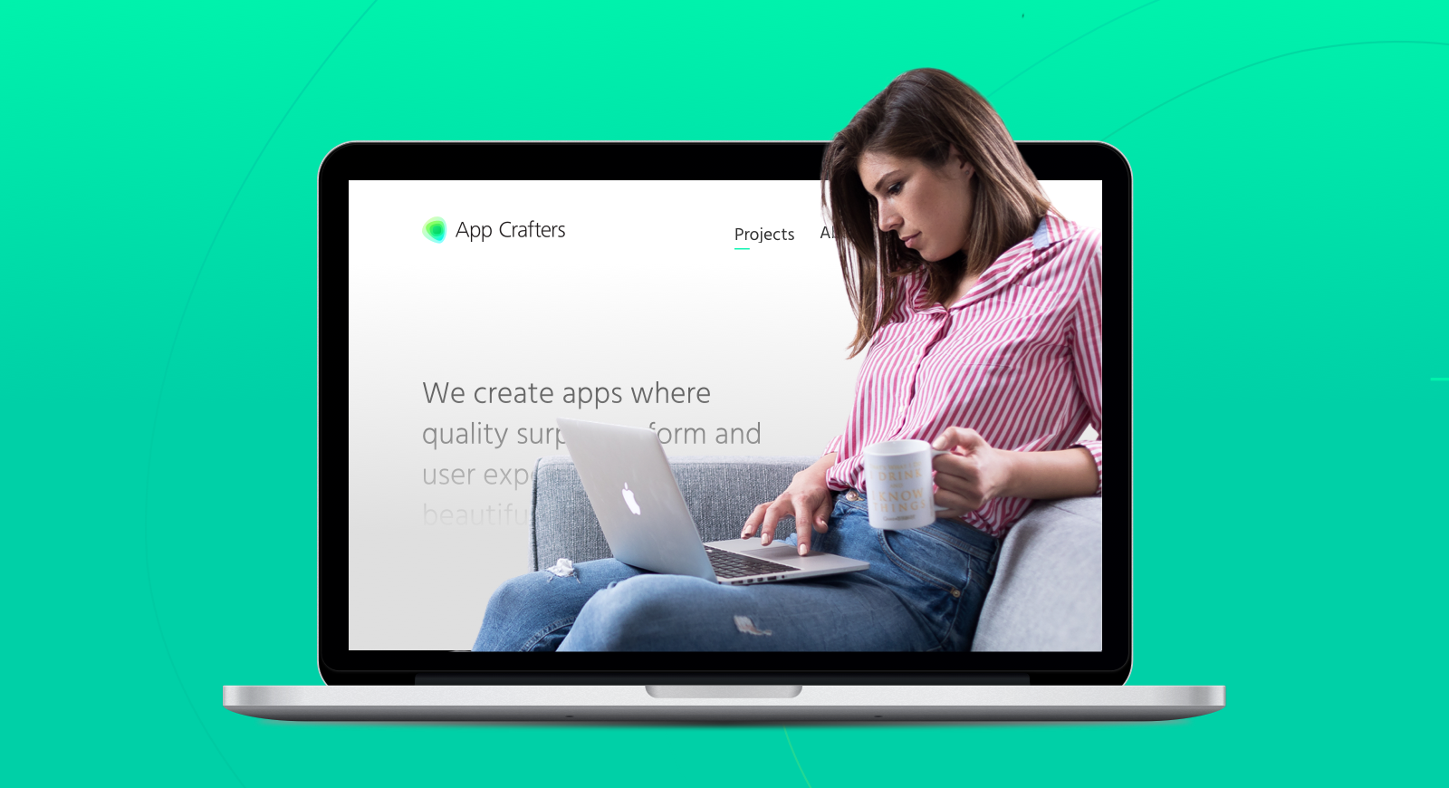
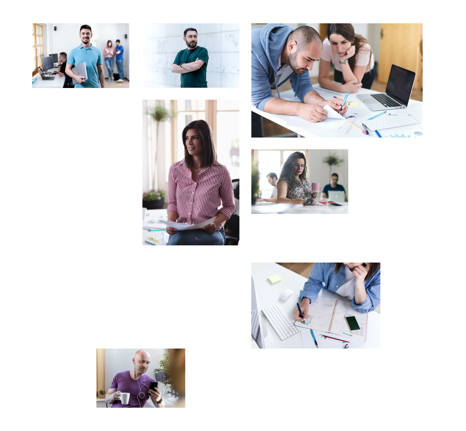
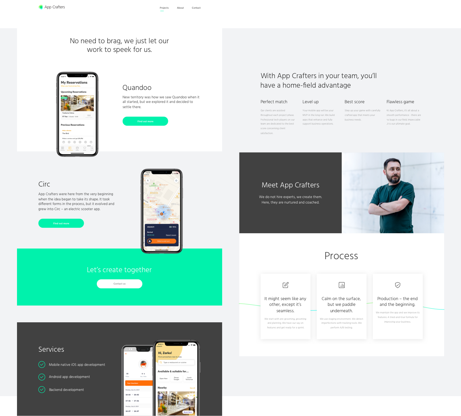
To make sure that all the elements work neatly together, we provided the art directions to our friends from Ziska, who were in charge of photography and copywriting. We kept in mind the SEO optimization and the way users scan through the content.
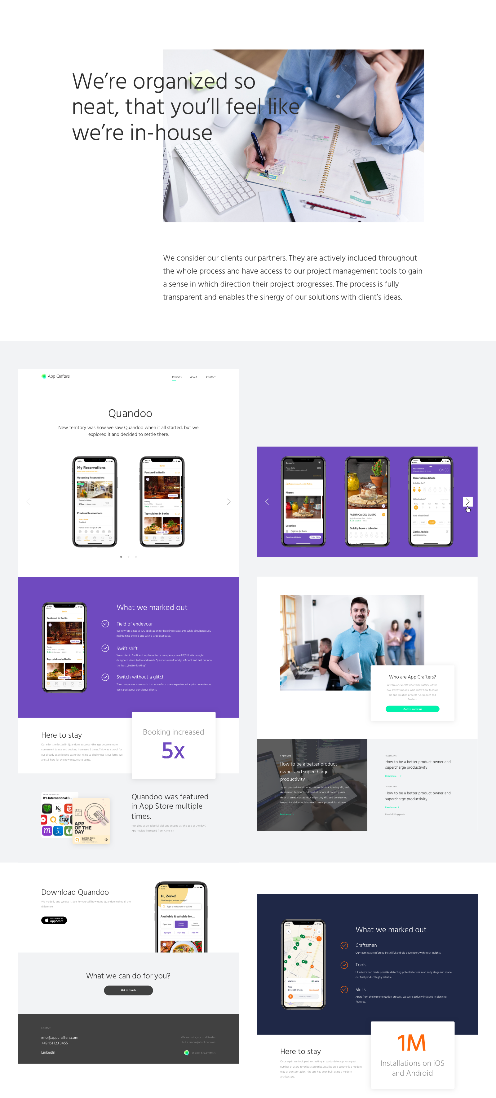
Wrapping the website up
Thorough thinking and planning, close collaboration, and constant communication with the client resulted in two satisfied parties and one epic design.
Amazed with what you've seen so far?
Let's build something similar!