
Why bother asking questions?
Why would people like to use a platform like this? How does it work? What can I find here? Is this the right place for me? Who are these course providers? Can I trust them?
Who are we making this for, after all?
1. Music teachers
2. Students and/ or their parents
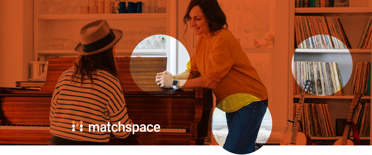
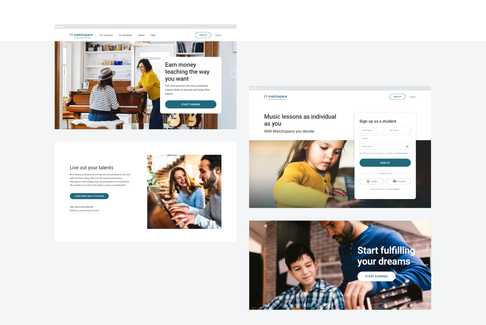
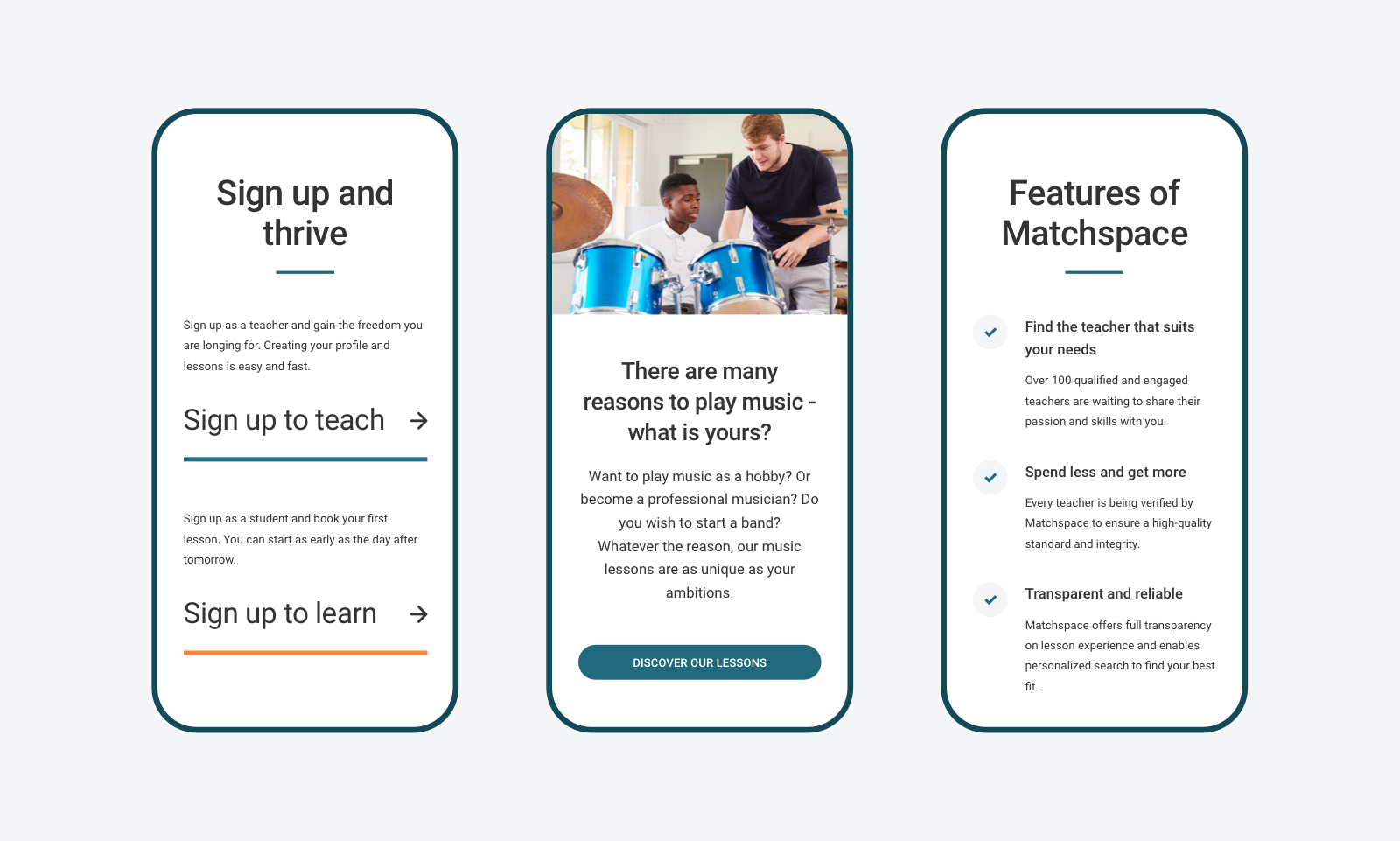
We based the content and visual design on the potential users' concerns.
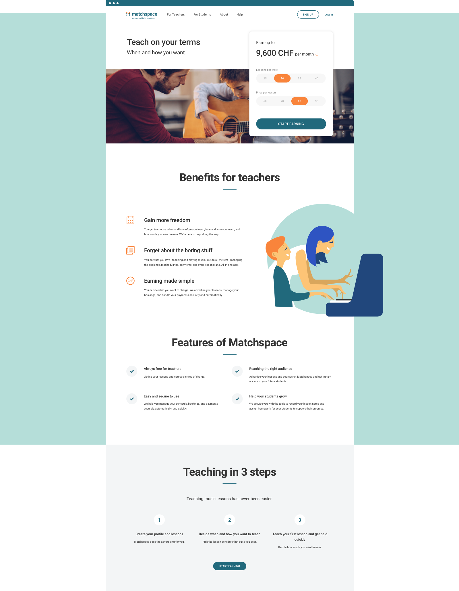
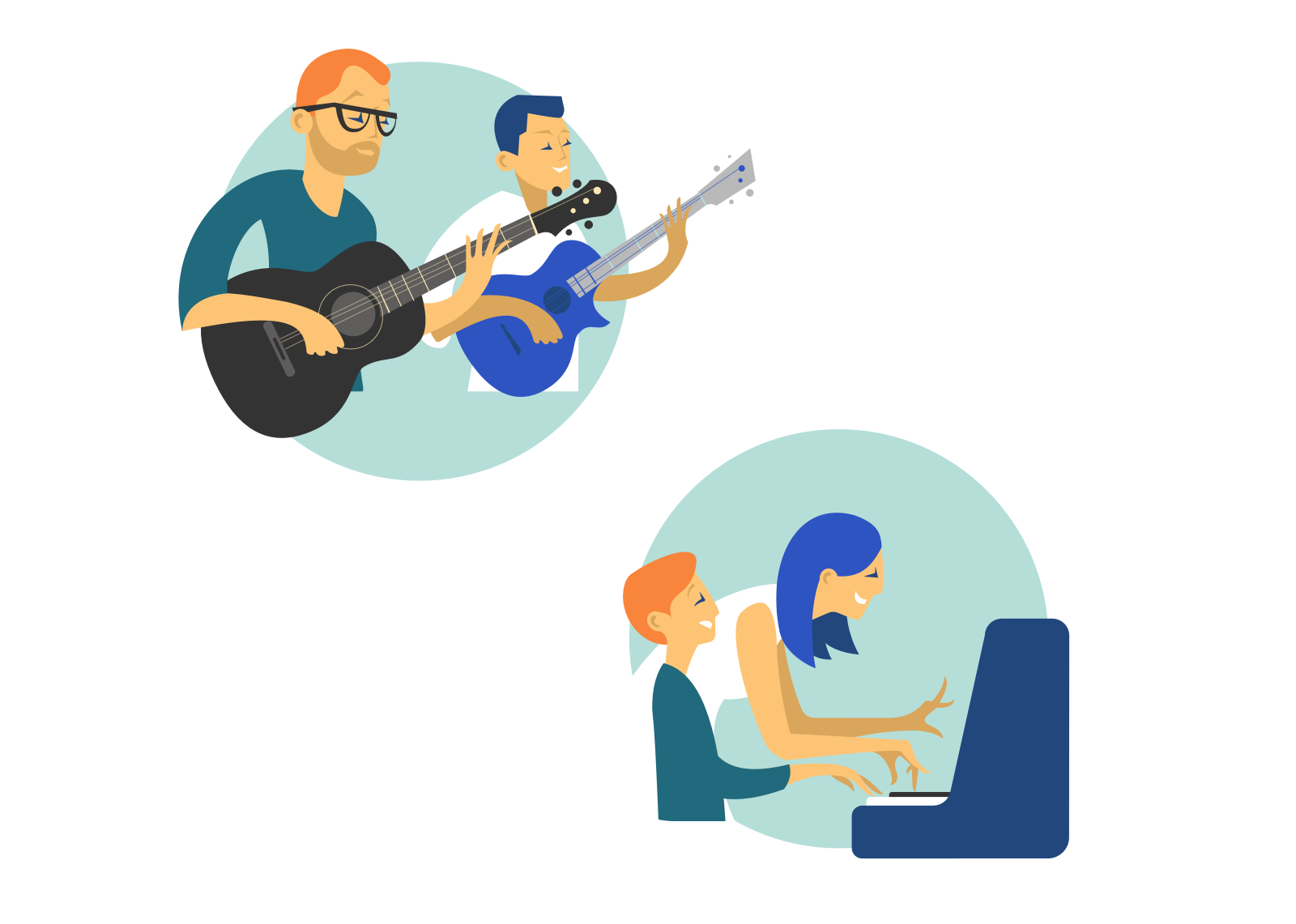
Personal connection is an imperative segment for both targeted groups. So we carefully picked the emotional photographs that represent teacher-student interactions. To create a more cohesive visual language, we designed stylish illustrations that follow brand colors.
Getting on the same page
Using wireframes right from the start guaranteed us effective communication with the client. We could easily update the design in the discovery stage, which saved us a lot of time.
Quick iterations based on the client’s feedback allowed us to stay efficient and keep the flow going.

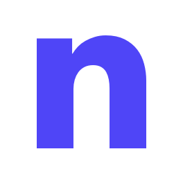
Increasing authenticity
Since the app already existed, we inherited the most basic elements. To level things up, we attacked the logo's weakest spots:
- The symbol dividing the name into two parts makes it harder to process.
- The slogan is positioned too close to the logotype.
- When used in smaller sizes, the slogan becomes illegible.
- The slogan is positioned too close to the logotype.
- When used in smaller sizes, the slogan becomes illegible.
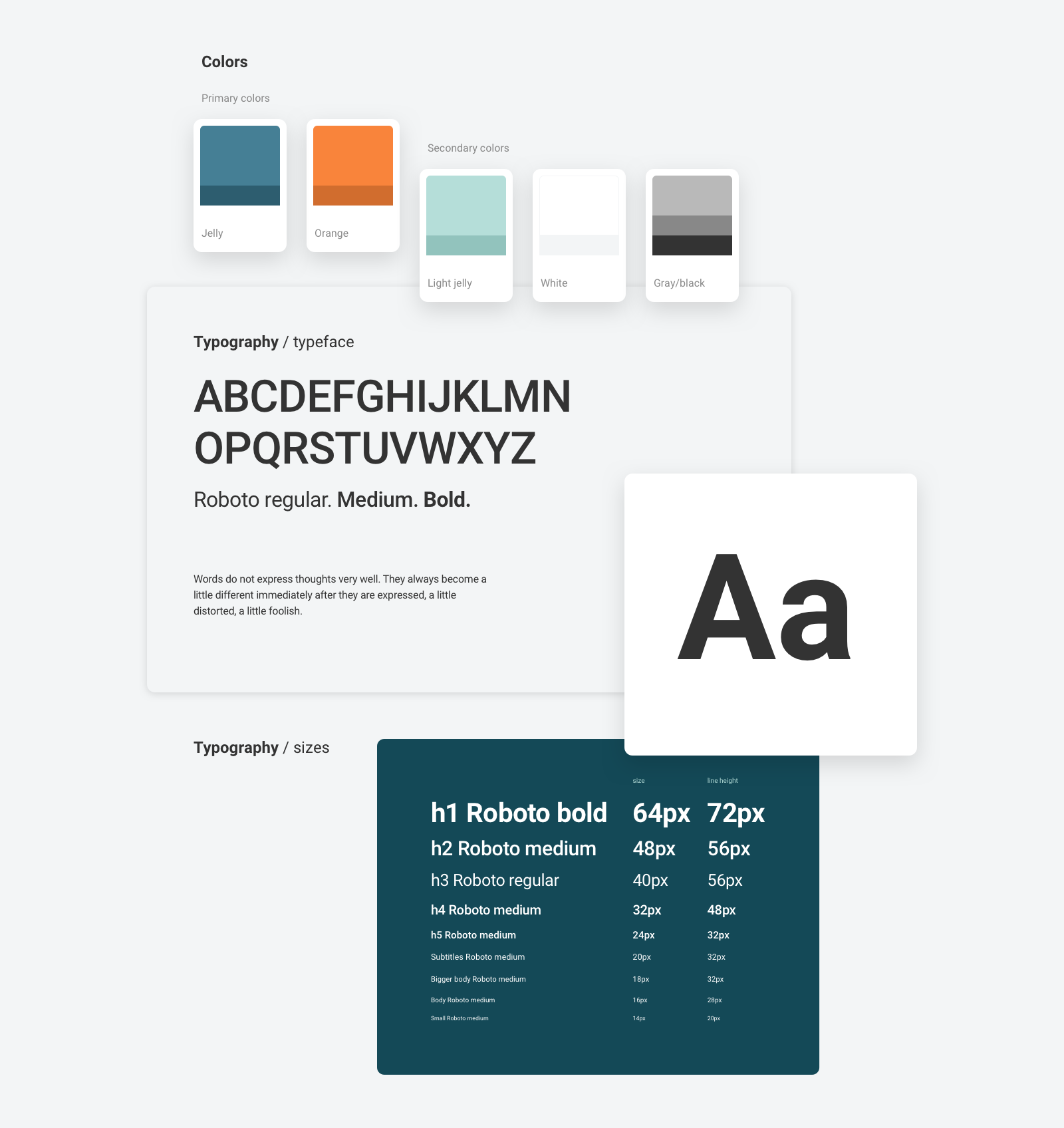
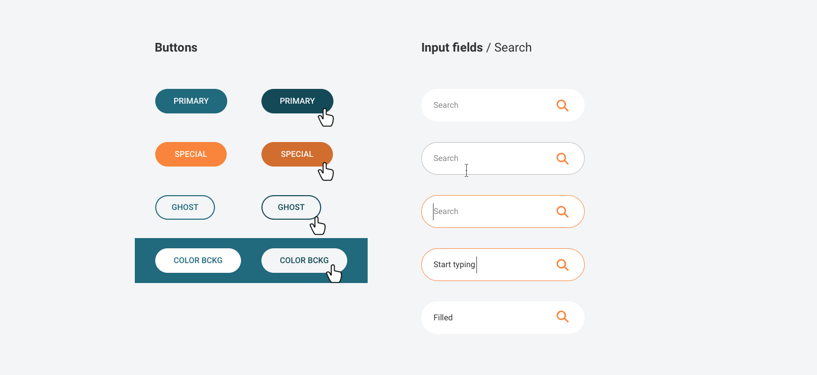
Building a long-lasting system, rather than just the website pages
To save the client's time and enable further website development, we structured the elements by building the styleguide.
Amazed with what you've seen so far?
Let's build something similar!