Why a new website?
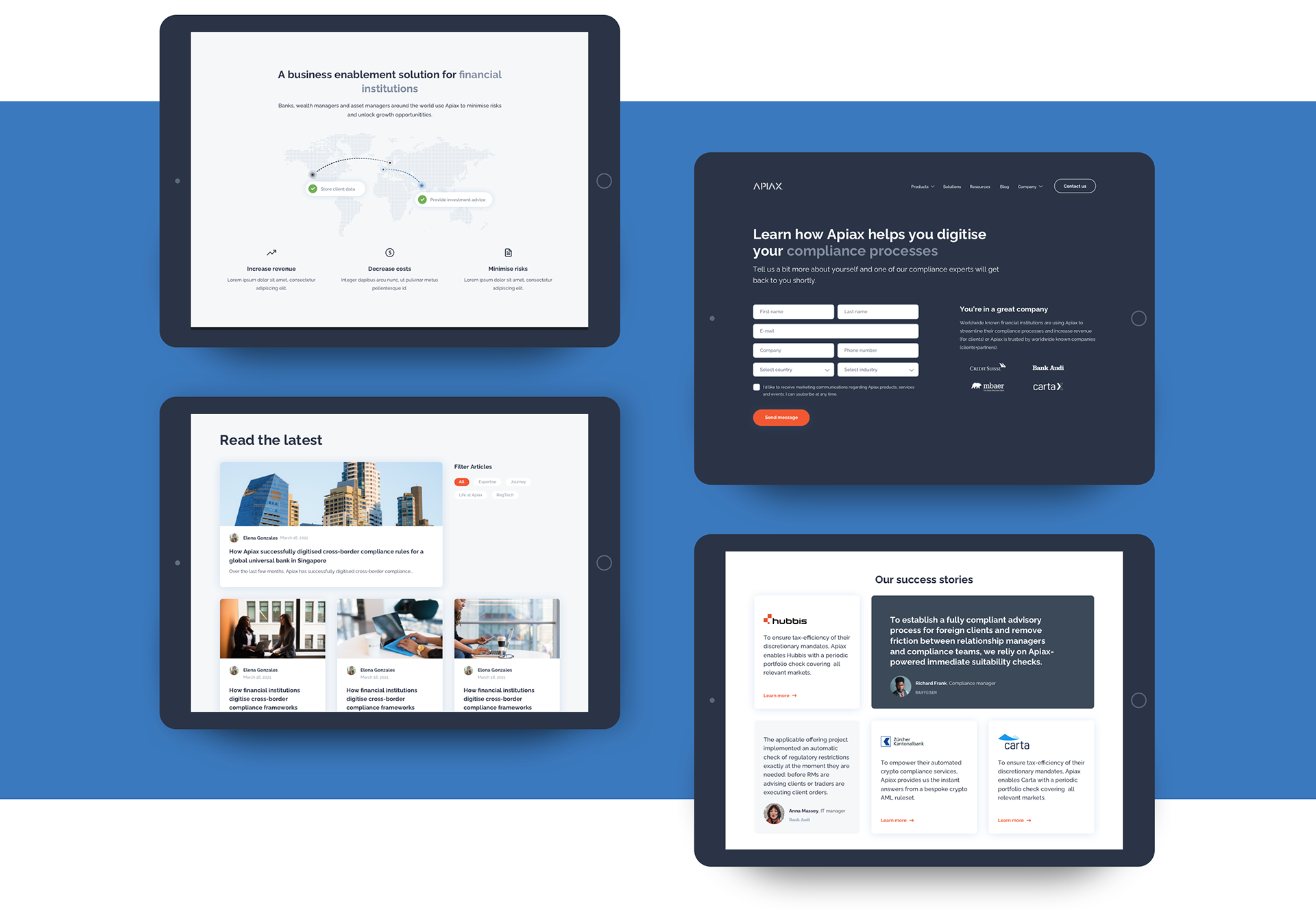
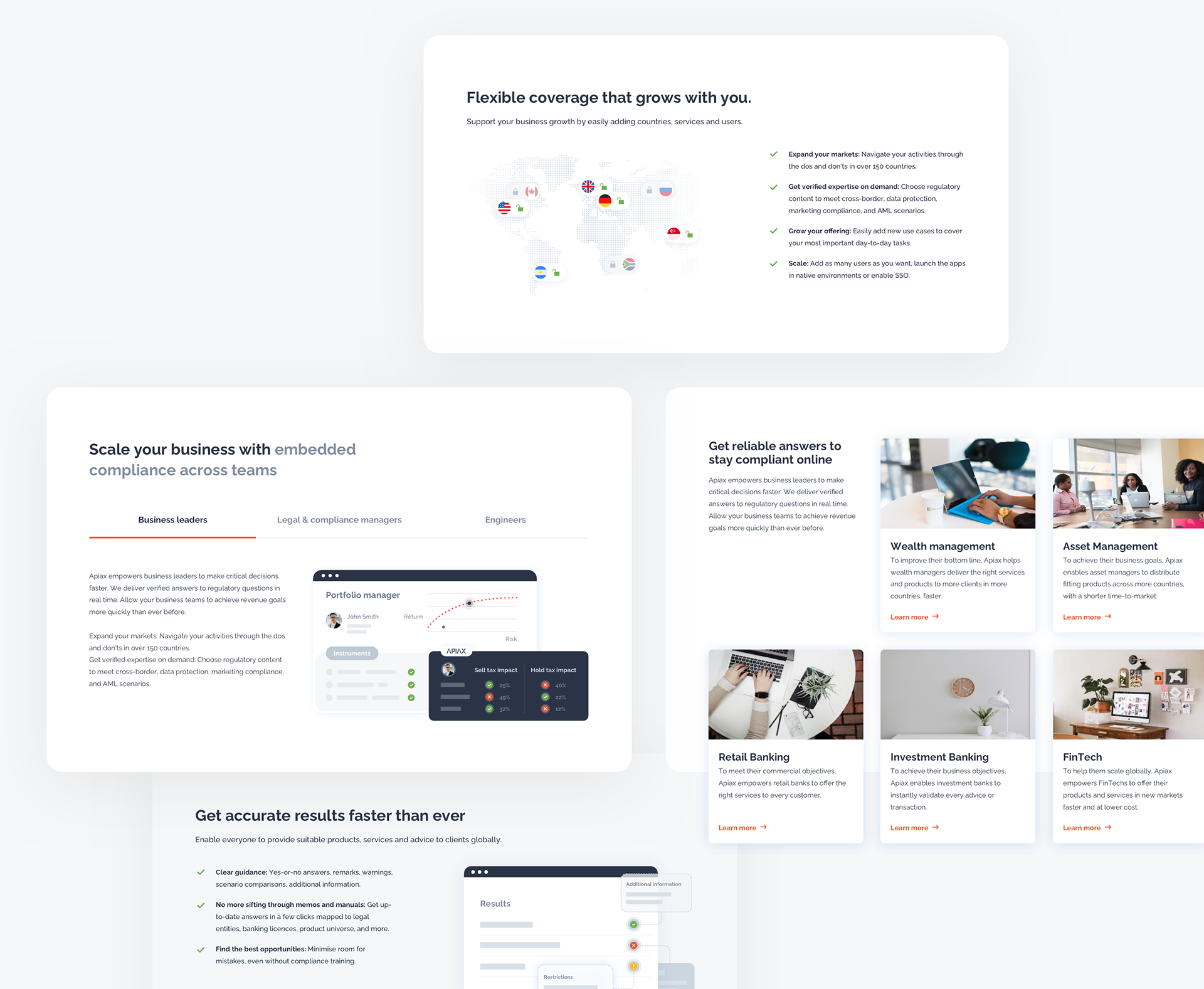
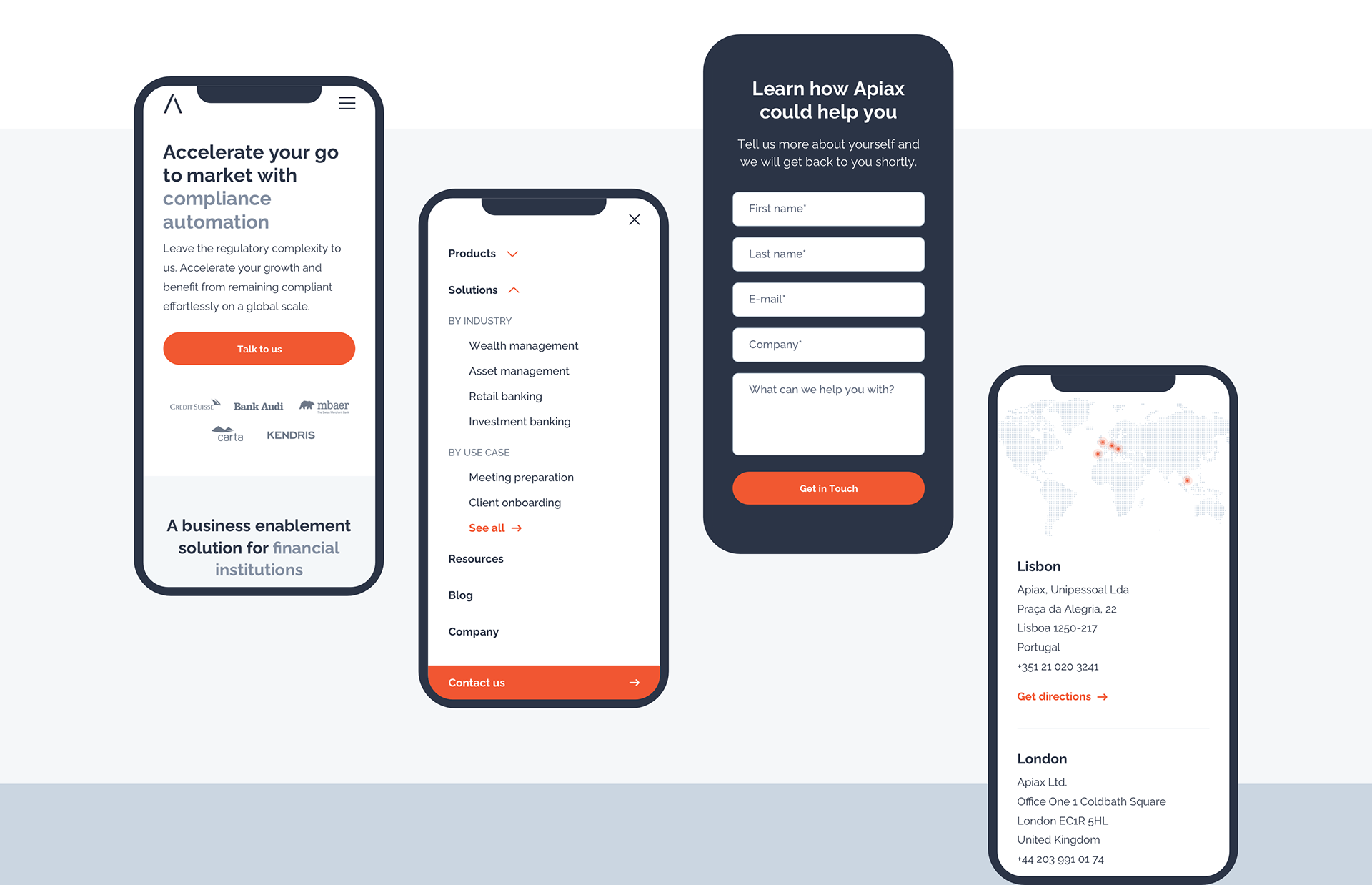
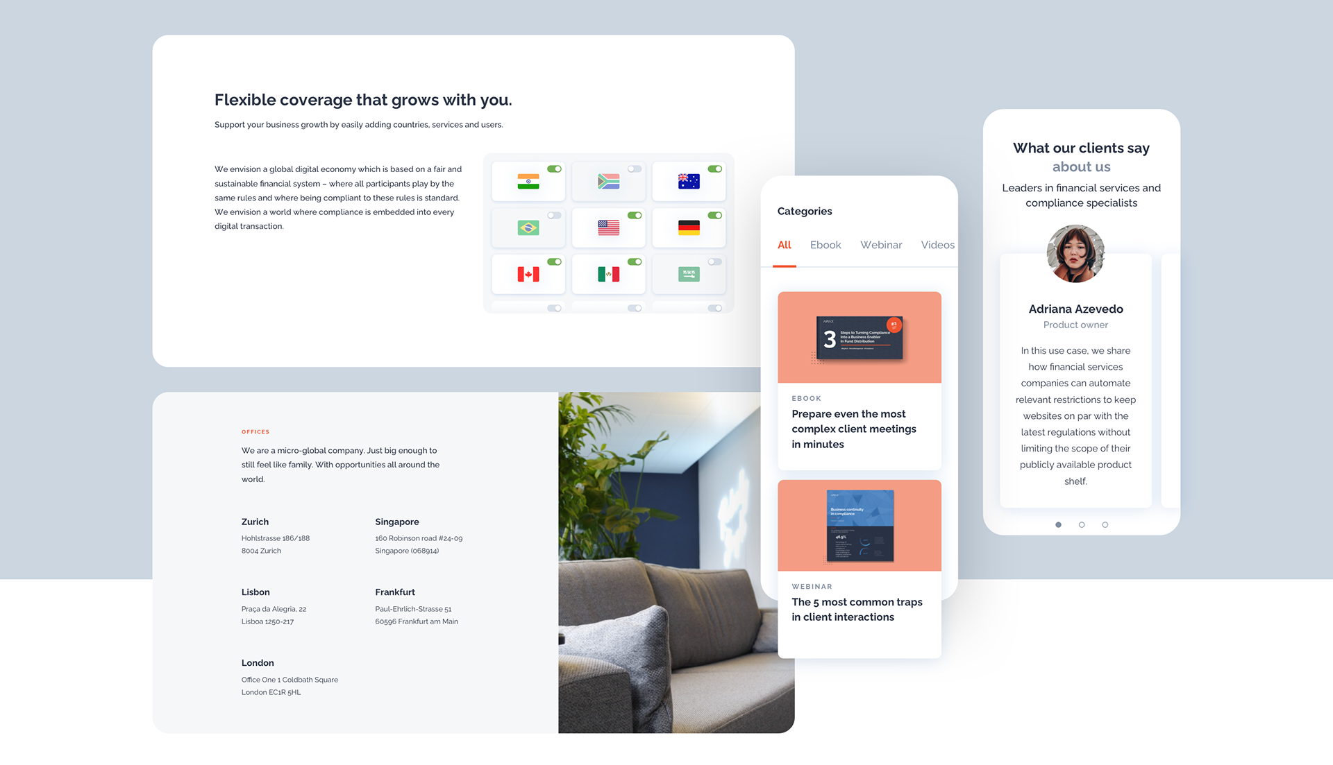
Apiax's existing website needed an overall revamp. Imbalanced screens overloaded with uncategorized information and inconsistent graphic elements seemed outdated in the ever-growing competitive market.
It was necessary to find a cohesive visual language, create new impactful sections and adapt the website to a more efficient mobile use.
Establishing creative direction
The redesign of the website should feel like a logical continuation of Apiax’s brand foundations. It also needed to meet their users’ expectations.
All the redundant elements were removed and made more visually appealing and easier for users to consume the content. The pages were rearranged and the header and footer were redesigned in both desktop and mobile versions. Unique and cohesive visual style pinpointed the product's benefits and explained what problems Apiax is solving for their users.
Benefits of a seamless styleguide
To make sure the design was long-lasting and accurately implemented, I spread awareness in the team about the importance of a styleguide. Setting up a consistent styleguide ensured a continuous brand experience and less effort and resources for future development.
I defined colors following accessibility guidelines and took a strict approach to the use of typography. I adjusted the components to be more responsive and customized for users on the go.
We established effective communication with the marketing department (indirectly also with the stakeholders) and with the development team. The close collaboration resulted in creating a bold and modern website that will resonate with Apiax's users.
Amazed with what you've seen so far?
Let's build something together!